Designing your home starts with a unified color scheme. This creates a cohesive and harmonious atmosphere. When choosing a color palette, think about natural light, existing elements, and your personal taste. A whole house color palette is a blueprint for decorating, saving time and money. We’ll explore the importance of color palette selection and offer tips for a beautiful space.
Choosing the right color palette for your home can be tough. But with the right guidance, you can create a space that shows your personality and style. The goal is to balance colors and elements for the look you want. Whether you prefer bold and contemporary or traditional and elegant, we’ll help you make the right choices.
We’ll dive into the world of color palettes to help you create a harmonious space. We’ll cover color theory basics and how to use accent colors. So, let’s start this journey to find the best color palette ideas for your home and make it special.
Key Takeaways
- A unified color scheme is essential for creating a cohesive and harmonious atmosphere in your home.
- The 60/30/10 interior decorating rule can help you balance your color palette.
- Testing paint colors with large swatches is vital to see how they look in a room.
- A successful color palette should include at least one neutral color, one white, and one darker contrasting color.
- Considering the natural light and existing elements in your space is vital for choosing the perfect color palette.
- The ultimate guide to choosing the perfect color palette for your home involves considering your personal preferences and style.
Understanding Color Theory Basics
Creating a harmonious home color scheme starts with color theory basics. Color theory helps us pick colors that look good together. A well-chosen color scheme can make a room feel welcoming and cozy. It’s all about matching colors to get a look that shows off your style.
The color wheel is a key part of color theory. It shows primary, secondary, and tertiary colors. Primary colors are red, blue, and yellow. Secondary colors are green, orange, and purple. Tertiary colors mix primary and secondary colors.
Warm colors like reds and oranges can make a space lively. Cool colors, such as blues and greens, can calm it down.
To get a balanced look, use the 60-30-10 rule. This means 60% of the room should be one color, 30% another, and 10% an accent color. Knowing color theory basics helps you pick colors that work well together. This way, your home color scheme will be both stunning and practical.
The Psychology Behind Home Color Schemes
Decorating with color is more than just picking colors. It’s about how colors affect our feelings and actions. Warm colors like reds and oranges make spaces lively. Cool colors, such as blues and greens, help us relax.
Neutral colors like white and gray are great for mixing with other hues. Using different shades of one color can make small spaces look bigger. Colors next to each other on the color wheel work well together, creating a smooth look.

Choosing the right colors can match your personality and lifestyle. For a cozy living room, try soft blues and earthy tones. For a calm bedroom, use muted greens and lavender.
The 60/30/10 rule is helpful for balancing colors. It says 60% of a room should be a light color, 30% a medium, and 10% a bold color. This rule helps create a space that’s both beautiful and functional.
The Ultimate Guide to Choosing the Perfect Color Palette
Choosing paint colors for your home is key to the look you want. A good color palette can make a room feel welcoming. Start by thinking about your space’s natural light. This affects how colors look.
Consider the light at different times and where it comes from. This helps pick the best colors for your home.
Understanding cool and warm tones is important. Cool tones, like blues and greens, calm a room. Warm tones, such as oranges and yellows, energize it. Mixing these can make a space feel both inviting and lively.
For example, navy blue and hot pink add a fun vibe. Charcoal gray and aubergine create a sophisticated feel.

Think about your space’s furniture, flooring, and decor when choosing colors. Pick colors that go well with these elements. Feel free to try out different color combinations.
The 60-30-10 rule can help. Use 60% of one color, 30% of another, and 10% as an accent. This makes your space look good and feel functional.
Some modern color palettes include:
- Neutral tones with pops of color, such as navy blue and gold
- Earth-toned combinations, like teal and ochre
- Bold and contemporary palettes, featuring bright colors like hot pink and yellow
Choosing paint colors is a personal choice. The right palette can make your space truly yours. Think about light, existing elements, and cool and warm tones. This way, you’ll create a space that shows off your style.
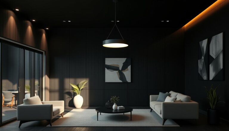
Popular Color Palettes for Modern Homes
Choosing a home color scheme can be fun. A good scheme has six or seven colors, including a main color and a few secondary ones. A neutral color is often the main choice for modern homes. It gives a solid base for adding more colors.
This way, the colors work well together, making the space feel balanced. A common mix is 60% main color, 30% secondary, and 10% accent. This mix works for many styles, from simple neutrals to bold and earthy tones.

Popular schemes include Modern Traditional, Shabby Chic, and Eclectic. These often blend neutral and bold colors. By picking a palette that shows your style and matches your home’s light, you make a space that’s modern and welcoming.
Creating Balance with Color Distribution
Decorating with color requires balance for a beautiful and harmonious space. The 60-30-10 rule is key in home design. It says 60% of the room should be one color, 30% another, and 10% an accent color.
This rule helps avoid a space feeling too busy or chaotic. For example, a bold color can be the main color. Then, use a softer color for the secondary and a bright color for accents. This way, you get a color scheme that’s both calming and visually appealing.
Here’s how to apply it:
- 60% of the room: dominant color (walls, large furnishings)
- 30% of the room: secondary color (draperies, bed linens, accent walls)
- 10% of the room: accent color (throws, pillows, artwork, decorative accessories)

By using the 60-30-10 rule, you can make a space that’s balanced and reflects your style. It also makes your home feel welcoming and peaceful.
Room-Specific Color Strategies
Choosing the right paint colors for your home is key. Each room has its own purpose, and picking colors that match can make it feel right. Warm colors like reds and oranges are great for dining and entertaining. They make the space feel cozy and inviting.
Cooler colors, such as blues and greens, are perfect for relaxing areas. They help create a calm and peaceful vibe. Think about how colors can change the feel of a room.
Light colors can make a room feel bigger and more open. Darker colors might make small spaces feel tight. Remember, natural light plays a big role in how colors look. Plan your colors with this in mind to make your home welcoming.

- Using monochromatic color schemes in bedrooms to create a cohesive and calming atmosphere
- Employing complimentary color palettes in living rooms to add visual interest and balance
- Selecting analogous color palettes in kitchens to promote harmony and create a sense of flow
Think about what each room needs. This way, you can pick colors that make your home look and feel its best. It’s all about finding the right colors for each space.
Working with Neutral Color Foundations
Neutral colors like white, beige, and gray are key for a harmonious home. They offer a clean base for your furniture and decor. This makes your space feel calm and serene.
Neutral colors are vital in interior design. White brings a minimalist feel and makes rooms seem bigger. Gray is versatile, fitting both cool and warm designs. Beige adds a traditional touch, making spaces feel cozy.
Understanding each color’s undertones is important. For example, mixing warm beige with cool gray adds interest. Adding wood and stone brings texture and warmth. Soft grays are great for bedrooms, while warmer tones like beige are perfect for living rooms.

Lighting and texture also play a big role in your color scheme. Soft lighting makes spaces cozy. Different textures, like velvet and linen, add depth and interest. By using neutral colors and these elements, you can make your home stylish and welcoming.
Incorporating Accent Colors Effectively
Decorating with color is all about accent colors. They can make or break a room’s look. Home design experts say balance and harmony are key. They often follow the 60-30-10 rule, where 60% of the room is a main color, 30% is secondary, and 10% is an accent.
This rule helps in many ways. It can add personality to a room or tie different parts of the house together. For example, a bold accent wall can make a room stand out. Or, a soft accent color can connect various design pieces.
Seasonal Color Updates
Updating accent colors with the seasons is another smart move. You can change throw pillows, blankets, or other decor to match the season. In fall and winter, warm colors like orange and red work well. In spring and summer, cool colors like blue and green are better.
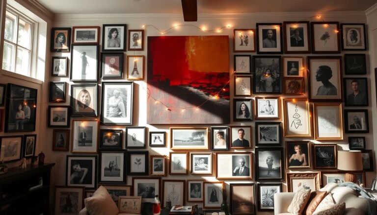
Statement Walls and Features
Statement walls and features are great for adding accent colors. A bold wall can make a room pop. A fancy piece of furniture can add elegance. Using accent colors thoughtfully makes a space lively and personal.
Some favorite accent color combos include:
- Monochromatic schemes use different shades of one color for a unified look.
- Complementary schemes pair colors opposite each other on the color wheel for a bold effect.
- Analogous schemes use colors next to each other on the color wheel for a soothing feel.
Color Coordination with Furniture and Decor
Choosing the right paint colors for your home is important. It’s key to think about your furniture and decor’s color palette. This way, everything works together to make your space look good.
Natural light changes how colors look throughout the day. Dark colors hide imperfections, while light colors show them more. This is something to keep in mind when picking colors.
Understanding how colors interact is vital. Warm colors like reds and oranges make a space feel cozy. Cool colors, like blues and greens, create a calm vibe. Mixing warm and cool tones is a good way to balance your space.
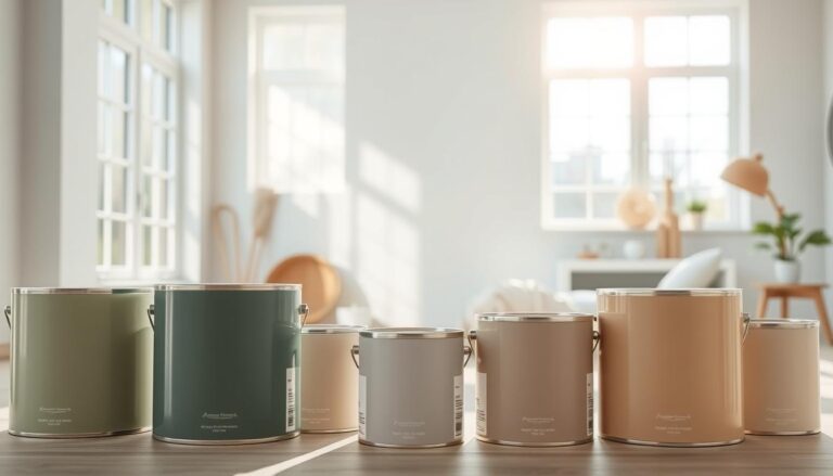
Using tools like the Coolors app can help pick colors. It’s also smart to stick to 3 to 5 colors in a room. With so many options, like Benjamin Moore’s 3,500 colors, it’s easy to get lost. Always test paint swatches in different lights to make sure they look good in your space.

- Considering the style and atmosphere you want to create in each room
- Choosing colors that complement your furniture and decor
- Testing paint swatches in different lighting conditions
- Working with 3 to 5 colors to maintain interest and coherence
By following these tips, you can make a space that looks balanced and nice. Remember, picking paint colors takes time and effort. But the end result is worth it.
Testing and Sampling Colors
Choosing a home color scheme requires testing and sampling colors. This ensures the colors you pick work well in your space. You need to see how colors look in different lights and on various surfaces.
Testing colors means looking at the Light Reflective Value (LRV) of the paint. LRV goes from 0 to 100, with black at 0 and white at 100. A higher LRV can make small rooms look bigger and brighter. It’s also key to test colors at different times and in different lights to see how they change.
Some tools for testing and sampling colors include:
- Paint swatches: These are small paint samples to test on walls.
- Sample boards: These are bigger boards painted with the color to see how it looks on a larger scale.
- Digital color visualization tools: These online tools let you upload a room photo and see color options.
Think about the room’s lighting too, as it changes how colors appear. For example, yellow lightbulbs can make white paint look more yellow. Testing and sampling colors helps you pick a scheme that’s both beautiful and functional.

Remember, testing and sampling colors is a key step in choosing a home color scheme. It ensures your interior color coordination is perfect and your home looks its best.
Common Color Palette Mistakes to Avoid
Decorating with color is all about creating a balanced space. One key tip is to avoid common mistakes. These include using too many colors, not following the 60-30-10 rule, and ignoring natural light.
To avoid these mistakes, follow simple guidelines. The 60-30-10 rule suggests using the main color for 60% of the space. The secondary color for 30%, and the accent color for 10%. This balance is essential for harmony. Also, natural light greatly affects how colors look throughout the day.
Other mistakes include overusing patterns, dark colors in small spaces, and ignoring window treatments. By being careful and using color tips, you can make your space both beautiful and functional.

Here are a few more tips to keep in mind:
- Use a total of three to five hues to create a harmonious color scheme
- Consider the function of the room when choosing colors
- Avoid using vivid colors together, as they can create a high-intensity environment
By following these tips and avoiding common mistakes, you can create a space that reflects your style. Always think about natural light and experiment with colors to find the perfect fit for your home.
Conclusion: Bringing Your Color Vision to Life
Choosing the perfect color palette for your home is a journey. It’s about transforming a space and evoking emotions. This guide will help you create a color scheme that shows your style and improves your home’s feel.
Whether you like calm earthy tones, lively bold accents, or classic monochromes, find a balance. This balance should match your decor and home’s design. With creativity and patience, you can make your color dreams come true.
The right color palette does more than look good. It makes your home a place of harmony and beauty. Trust your instincts and seek help when needed. Let color turn your home into a personal sanctuary.